// 4 September 2026
Why I build the website before anyone asks for it
Most of a website project isn't building the website. It's waiting for photographs, chasing an answer, and quietly talking somebody out of the version of their own business they think they can afford. So I've started building the thing first and asking afterwards.
- · business
- · process
- · design
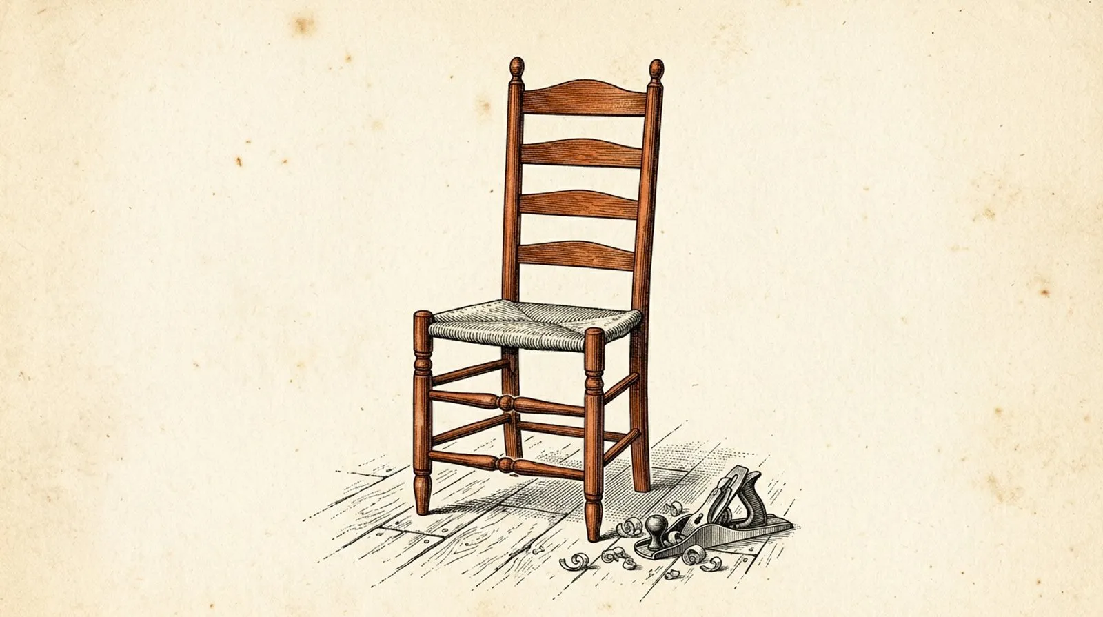
Every so often I pick a local business, build them a complete website, and email it to them. There’s no brief, no meeting and no invoice attached, and until the email arrives they’ve no idea I’ve been working on it.
It’s an unusual way to go about things, and it’s worth explaining how I ended up here, because the reasoning says something fairly unflattering about the way website projects normally run.
Where the time actually goes
If you’ve never commissioned a website, you’d reasonably assume that most of what you’re paying for is the building of it. In practice that’s the smallest part of the job.
Actually building the thing you can see accounts for roughly a third of the hours. Another quarter goes on the half nobody asks for: structured data, heading order, page descriptions, legal pages, hosting and redirects, all the invisible work that decides whether you turn up in a search result at all.
The remaining slice, and it’s the largest of the three, is spent waiting. Waiting for photographs. Waiting to find out whether you do bathrooms as well as kitchens. Sending a third email about the opening hours, or receiving a logo as a screenshot of a screenshot. Then, once there’s finally something on screen to react to, the revisions begin, and they have a rhythm of their own: shall we try it the other way, and then, on reflection, could we go back to how it was on Tuesday.
None of that is anybody behaving badly. It’s simply what happens when somebody who already has a full-time job takes on the project management of a website alongside it. But it’s where the weeks go, and it’s why a job quoted in weeks can quietly become a job that takes six months.
People ask for less than they could have
The second reason is more awkward to write about, because it involves telling people something about their own intentions.
By the time a client approaches me having decided they need a website, they’ve usually also decided what sort of website they’re allowed to have. They want something that works, something that does the job. Often they’ll send over an example of a site they like, and it isn’t unusual for that example to be ten years old.
I don’t think that’s a failure of taste. I think it’s a price guess. Somewhere along the line “distinctive” and “expensive” got welded together, and the safe move became asking for something modest rather than risking a quote for something you assume you can’t have.
That weld came apart a while ago. A full-screen video, a considered typographic identity, page transitions, an interactive map: on the way I build now, none of those carry the cost they once did. Time is what costs money, and most of the time isn’t spent on the interesting parts. So when somebody asks me for something plain, I genuinely can’t tell whether they want plain or whether they’re flinching at a figure they’ve imagined, because from the outside the two look identical.
Reacting is easier than describing
Which brings me to the part I keep coming back to. Ask somebody to describe the website they want and you’ll get adjectives. Show them a finished homepage and within about four seconds you’ll hear that it’s too dark, that the horse should be bigger, and that the phone number belongs at the top. That’s real, usable direction, and there’s no way to get it out of a blank page.
It’s the same reasoning behind skipping the mockup stage, which I’ve written about over on how it works. A flat picture of a website is a worse version of a website that takes nearly as long to produce. If reacting to something real is what unlocks the useful feedback, then the quickest route is to build something real, and doing that before anyone asks is simply that idea taken to its conclusion. Instead of a starting point we arrive at together over six weeks, there’s one sitting there on day one.
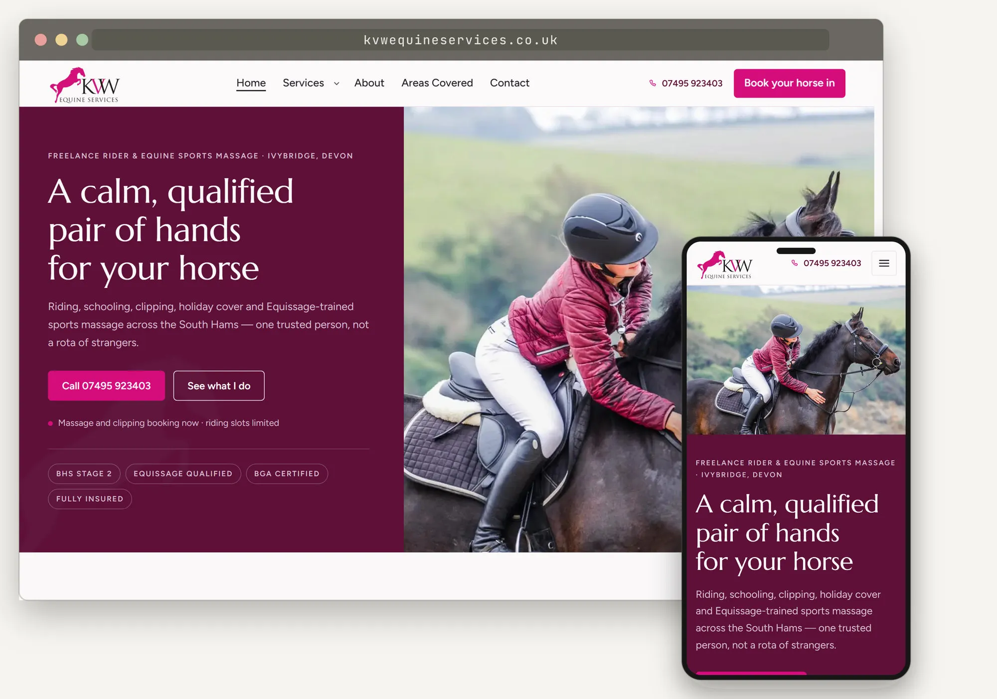
KVW Equine Services, a freelance rider and equine sports massage therapist near Ivybridge. There was no existing website, so the photographs and the qualifications came from her own Facebook page.
Where the content comes from
The obvious objection is that chasing content is the very thing I’ve just described as the slowest part of the job. The answer is that I don’t chase it. I use what’s already public.
Most small businesses have been publishing their own material for years without thinking of it in those terms: a Facebook page full of photographs of finished work, a Google Business Profile carrying the opening hours and the reviews, an older website listing the services, a trade profile with the certifications on it. That’s usually enough to work from, and the photographs matter most of all. Real pictures of your real work beat anything I could buy or generate, an argument I’ve made at length in show your work, not someone else’s. If your Facebook page holds three years of finished kitchens, I don’t need a photoshoot. I need an afternoon.
What I can’t get from public material is everything only the owner knows: that they’ve quietly stopped offering a service, which job they’re proudest of, or that they’d like to move away from one side of the business altogether. So the first version is a set of educated guesses, and some of them will be wrong. That’s not a flaw in the approach so much as the point of it, because being wrong in a specific way is far easier to correct than starting from nothing at all.
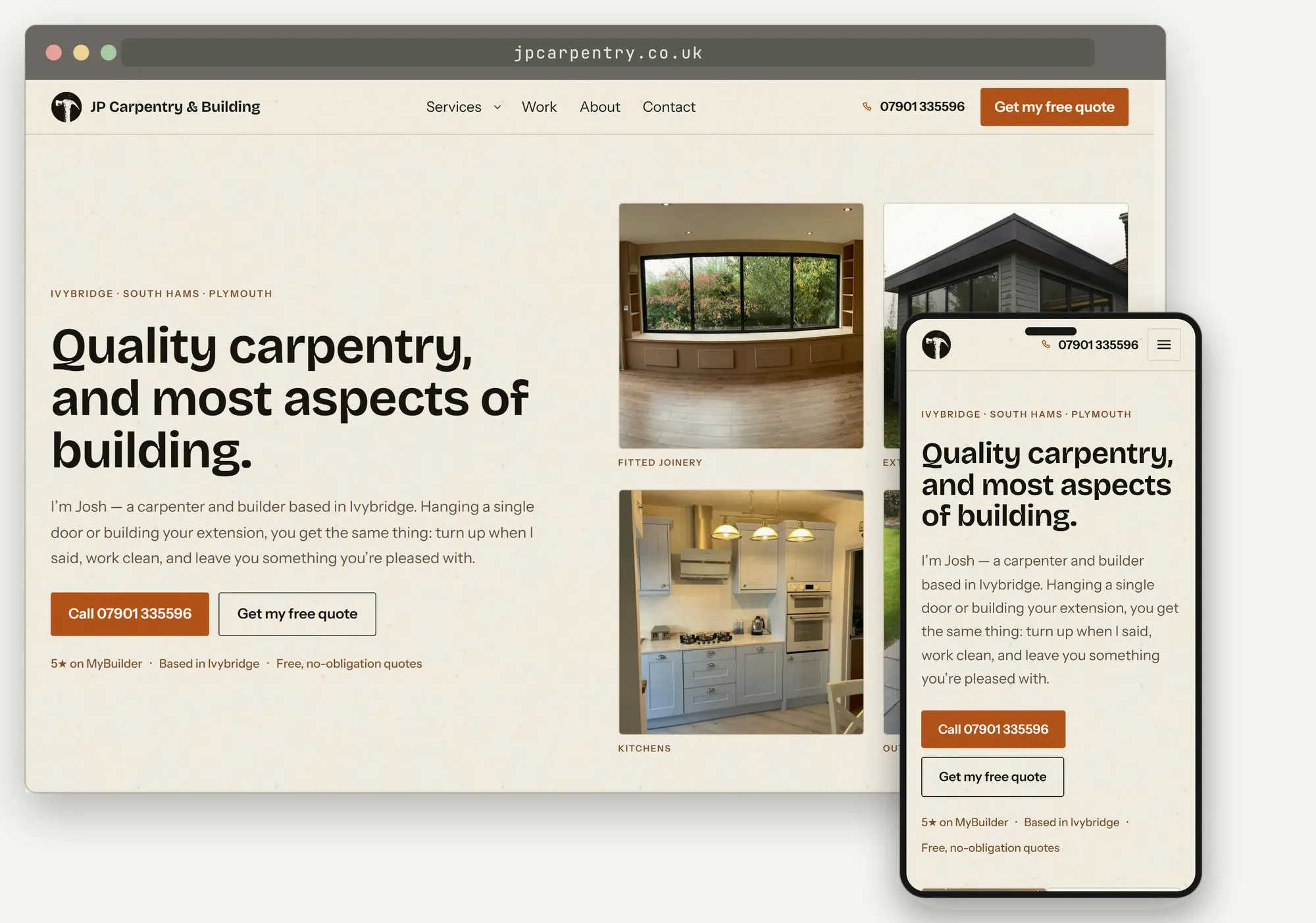
JP Carpentry & Building, Ivybridge. Every photograph on that page is Josh’s own work, taken from Facebook. Nothing was bought and nothing was generated.
Reading the identity that’s already there
An existing sense of identity makes this approach work better rather than worse, which is perhaps the opposite of what you’d expect from something built at arm’s length.
A great many businesses have already made real decisions about how they look, even if they’d never use the word brand to describe it. A hair salon’s Instagram might run on earthy tones, embossed lettering and a plastered wall texture, with bronze accents and generously rounded corners. That’s a coherent visual language with a name in the trade, quiet luxury, and it can be read off a social feed or an existing site and carried straight across to a website.
Where a client has clearly thought it through, carrying it across is exactly what I do, following their design and their wording closely rather than substituting my own judgement for theirs. Where less thought has gone into it, I’ll take what’s there and look for the places it could be sharpened. What I try never to do is head off in an unrelated direction, and the same principle applies to tone of voice: if a business writes to its customers in a particular way, that ought to survive the move onto a website rather than being flattened into whatever a web page is expected to sound like.
The best version of this job isn’t inventing something new. It’s recognising what somebody has already built and giving it somewhere better to live.
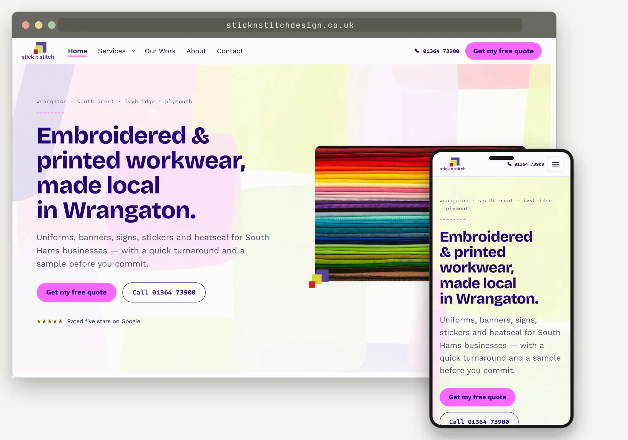
Stick n Stitch Design, Wrangaton. The brand was already bright and that energy was worth keeping. Most of the work went into carrying it across while getting the type onto backgrounds that hold up to a contrast check, so the colour does its job without costing anybody legibility.
It’s a real website, not a picture of one
It’s worth being precise about what actually gets sent, because the phrase “spec site” tends to make people imagine a template with a logo dropped onto it.
What lands in the inbox is a complete, working site: real pages and navigation, a working enquiry form, written page descriptions, structured data, legal pages, an accessibility pass, hosted and loading in well under a second. If the owner says yes, it’s close to ready to point at their own domain. (The address shown in the browser bar in these pictures is the one the site would end up on. While it’s still a preview it sits on a holding address of mine, and that’s the link that gets emailed over.) The unglamorous half is done up front, because it would cost the same done later and I’d rather find out early whether the thing is wanted at all.
Clients are also perfectly entitled to dislike it. Nobody is committed to anything by receiving an email, and if the answer is that the colours are wrong and they stopped offering that service last year, then we run the revision round we’d have run anyway, starting from a site rather than from a conversation about a site. If the answer is nothing at all, that’s an answer too.
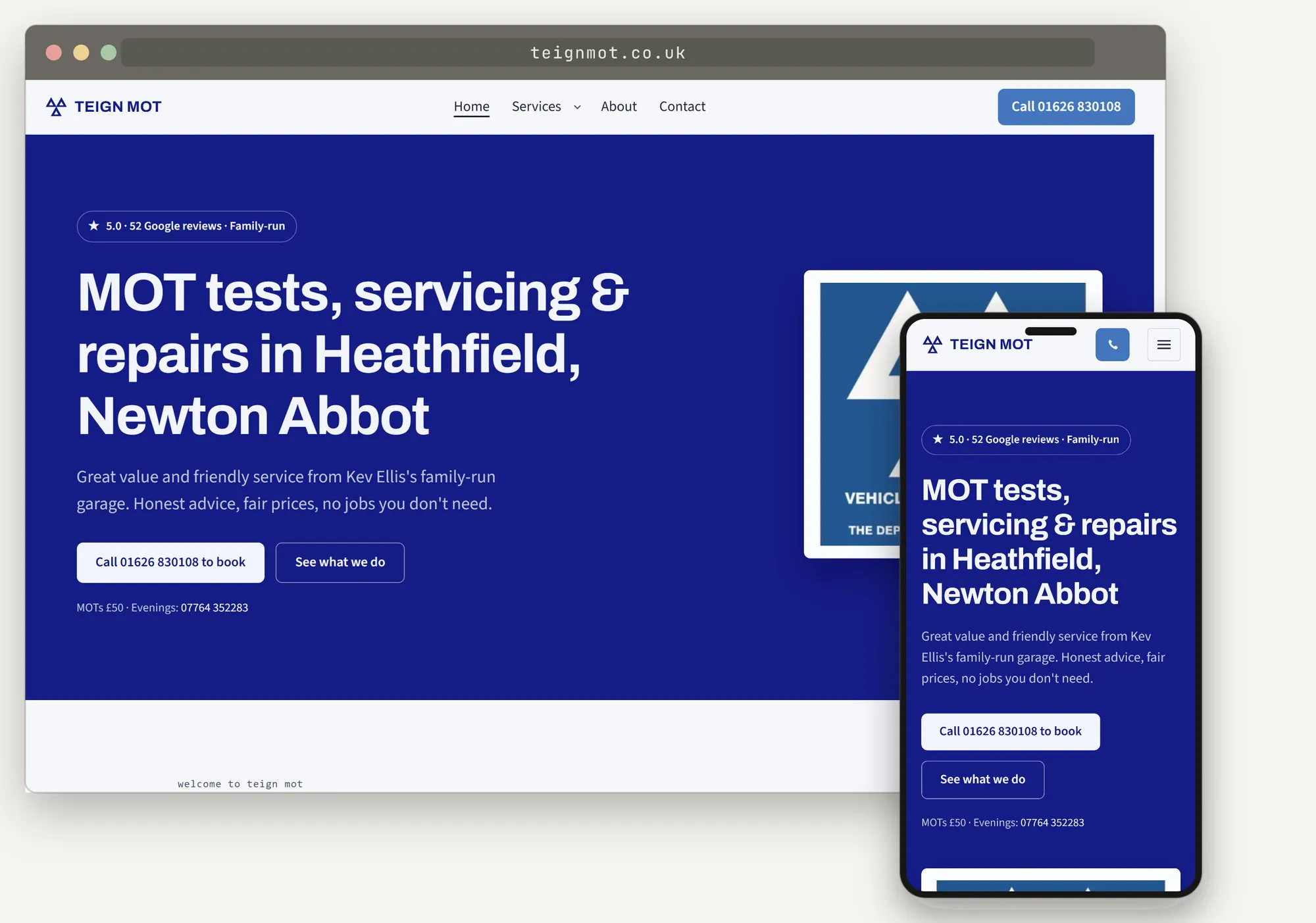
Teign MOT, Heathfield. A family-run garage with fifty-two five-star reviews, none of which appeared anywhere near the top of the site they had at the time.
What it costs, either way
For the business, nothing. There’s no invoice attached to an unsolicited website, which I mention only because a few people have understandably assumed there must be a catch somewhere. If they want it, normal pricing applies and they get a fixed written quote before anything else happens. If they don’t, the preview comes down.
I’ll often take something off that price as well, and the reasoning is arithmetic rather than generosity. When somebody sees the site and takes it broadly as it stands, the expensive half of the project simply never happens: there’s no content to chase and no long revision cycle to work through, so the job has cost me a fraction of what it normally would. It seems only fair that some of that saving goes back to the client rather than all of it staying with me.
What I get out of it
The risk sits with me, and it’s a real one. I’ve built sites that nobody wanted, and I’ll build more of them.
It’s worth it for two reasons. The first is straightforward: building websites is the part of this job I’d be doing anyway, and given a free evening it’s what I choose to spend it on. The second is more practical. Every build makes the next one better. I get quicker at the parts that are always the same, my eye sharpens for the design decisions that actually matter, and the tooling I’ve built up around the static stack gets extended a little each time. A site nobody buys still leaves me with all of that, which means there’s no version of this where I come away with nothing.
Where it genuinely doesn’t fit
I should be even-handed about the limits, because there are some.
It works best where a business is straightforward to understand from the outside: a trade, a garage, a therapist, a small maker. If the website’s job is to look credible and get the phone ringing, a well-informed guess from public material lands close enough to be worth reacting to.
It doesn’t work for anything with real machinery behind it. Booking systems, memberships, payments and integrations all need a conversation first, because the decisions that matter there aren’t visual ones, and no amount of studying a Facebook page will tell me how a business actually handles its bookings or what it needs a membership area to do.
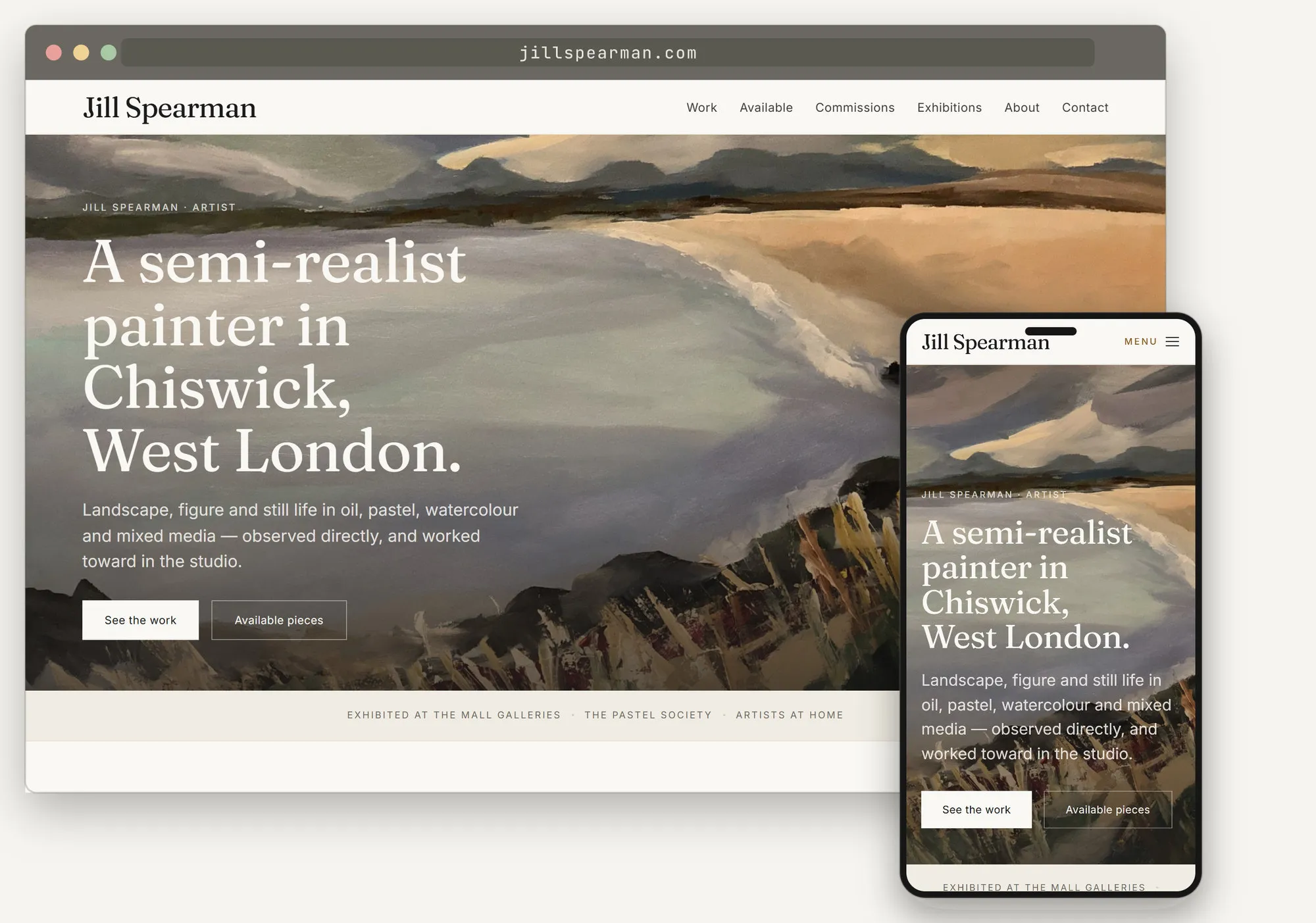
Jill Spearman, a painter in Chiswick. Artists are a good test of the whole idea, because the work is already photographed and the only real design question is how far to get out of its way.
The short version
Most of what makes a website slow and expensive isn’t the website. It’s the distance between somebody deciding they need one and there being something in front of them to look at, so I close that distance first and ask afterwards.
A first draft usually takes a couple of days, a small site is typically live inside a week or two, and a larger one runs to a few weeks rather than a few months. Those are typical figures rather than promises, and the honest variable isn’t me. It’s how quickly the owner can come back on the things only they can answer, and building the site first takes most of those off the critical path, which is the entire point of doing it this way round.
If a site with your name on it has arrived in your inbox and you’re wondering what the catch is, there isn’t one, and you’re very welcome to tell me it’s wrong.
// thanks for reading
If something here was useful, or wrong, I'd like to hear about it. Email james@willcocks.uk.